Whatup Austin! Here’s how to take cool profiles photos for dating apps like Bumble…
If you’re single and dating in Austin, we are so here for you. Can you tell, we’re still totally stoked for our Austin launch! That said, this post is actually for all you lovely single people out there who might be new to the dating scene after a break. Or you might just be really fed up with your current profile photos, which are garnering no attention online. Take a moment to read through this post as I have pulled together the most common questions Saskia, the creator of dating photography, gets asked when she delivers one of her Tinder Photo Surgeries (that’s when she gets asked to go through people’s dating app profiles and share her honest feedback).
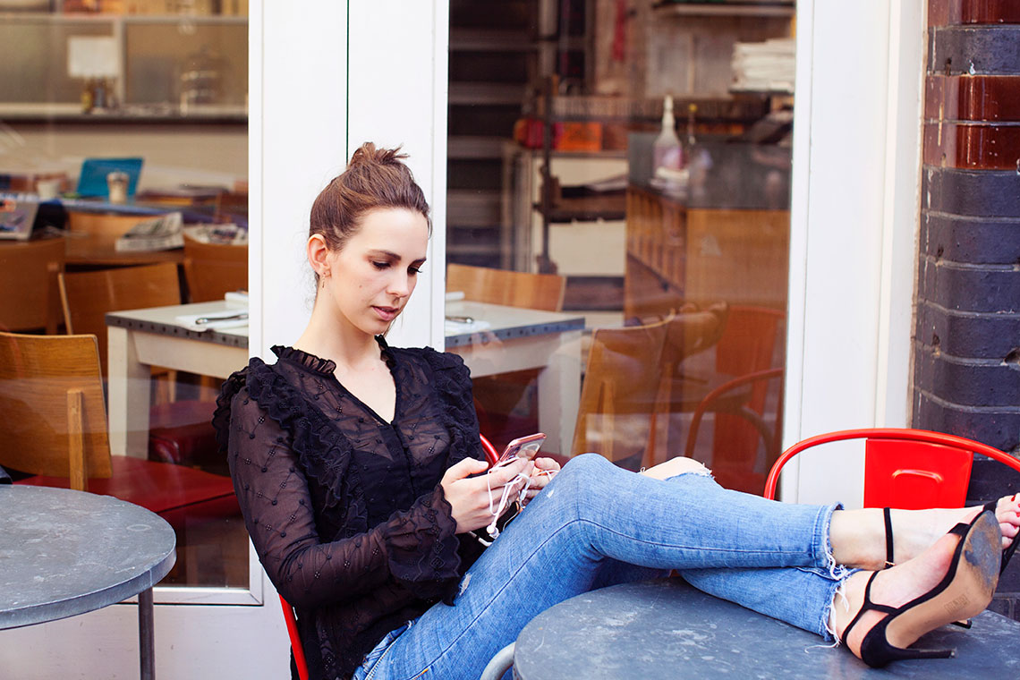
So Saskia, which three photos should you always include on your dating profile?
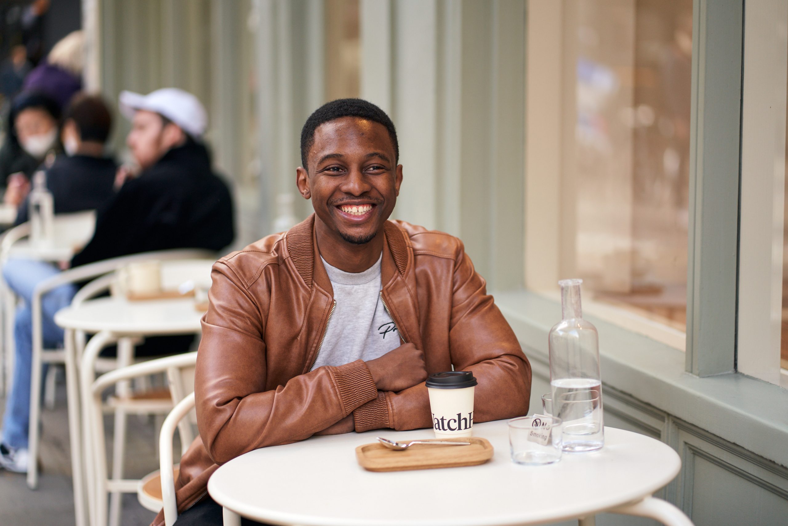
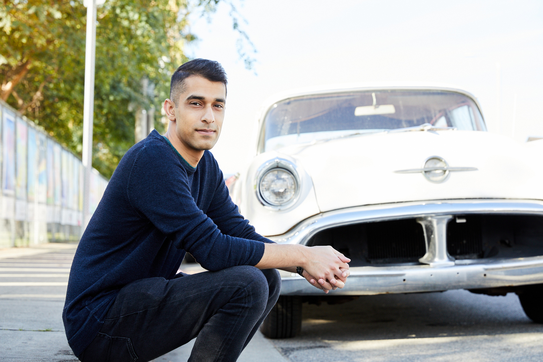
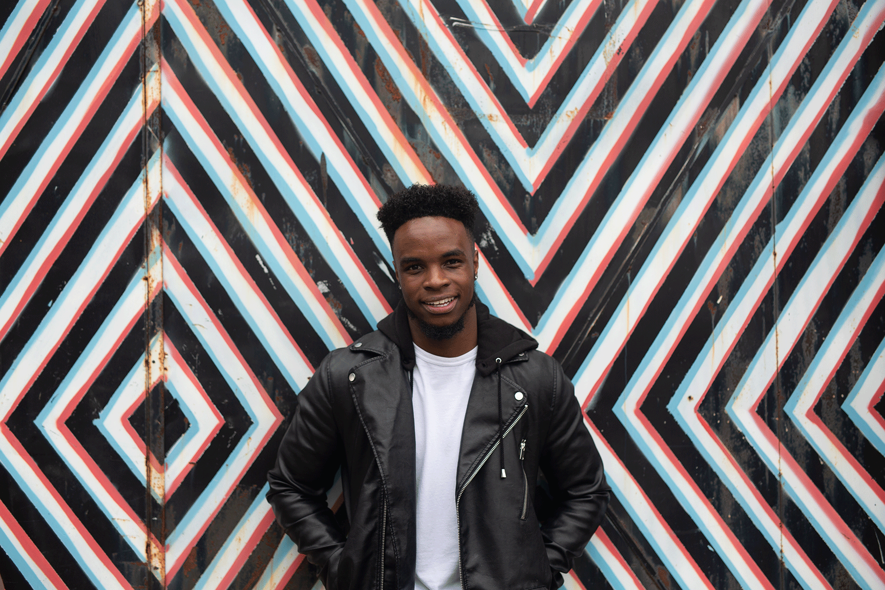
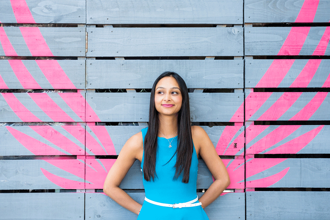
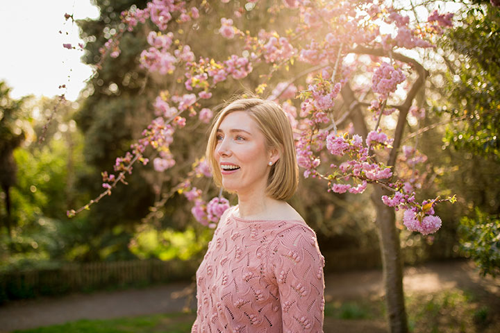
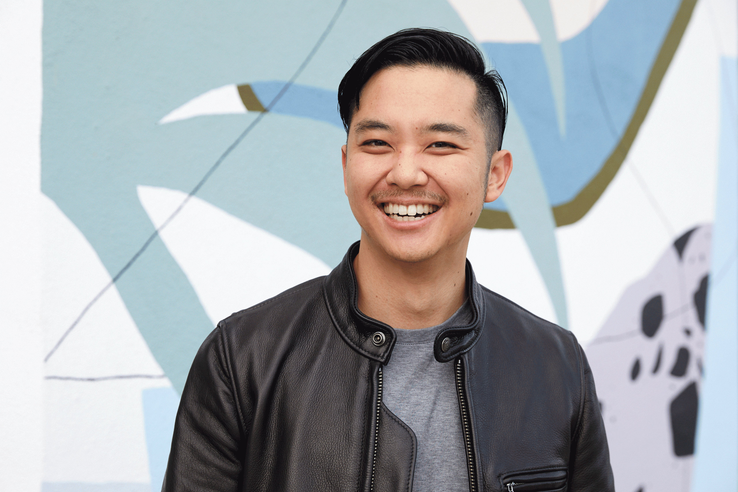
01. OK, so you will always need a stand-out, gorgeous primary photo, which should just be of your head and shoulders so your face can be seen really clearly. It should also show you looking gorgeous, happy, relaxed and approachable. It needs to be so good, it stops people in their scrolling tracks.
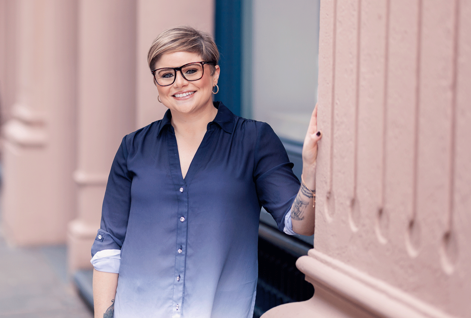
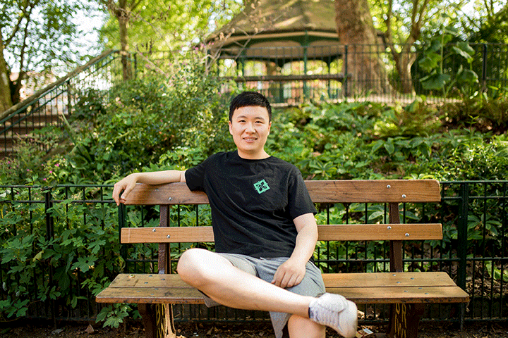
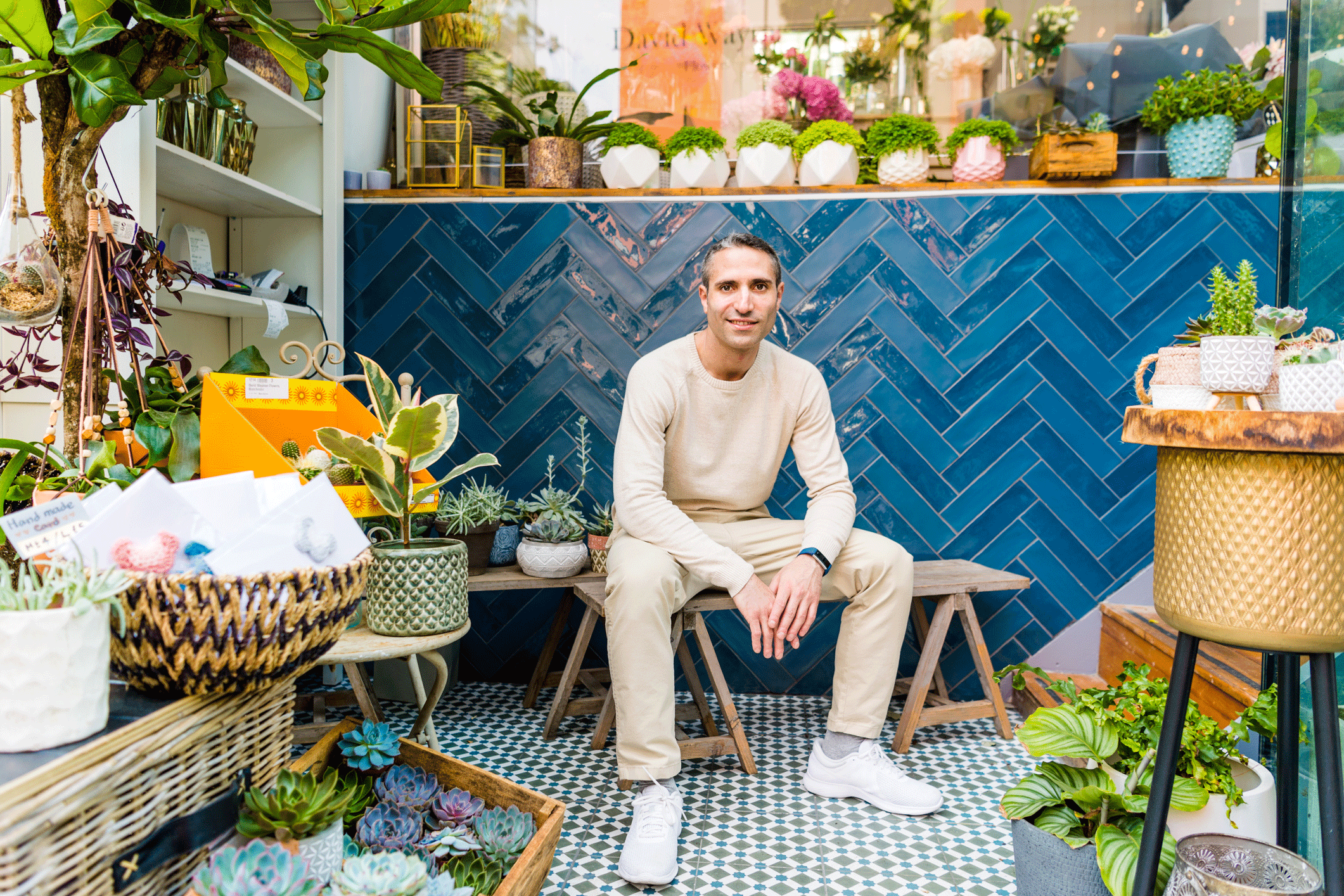
02. You also need a full body or three-quarter length photo to show people what you look like. Head and shoulder shots on their own can be misleading about people’s size and shape.
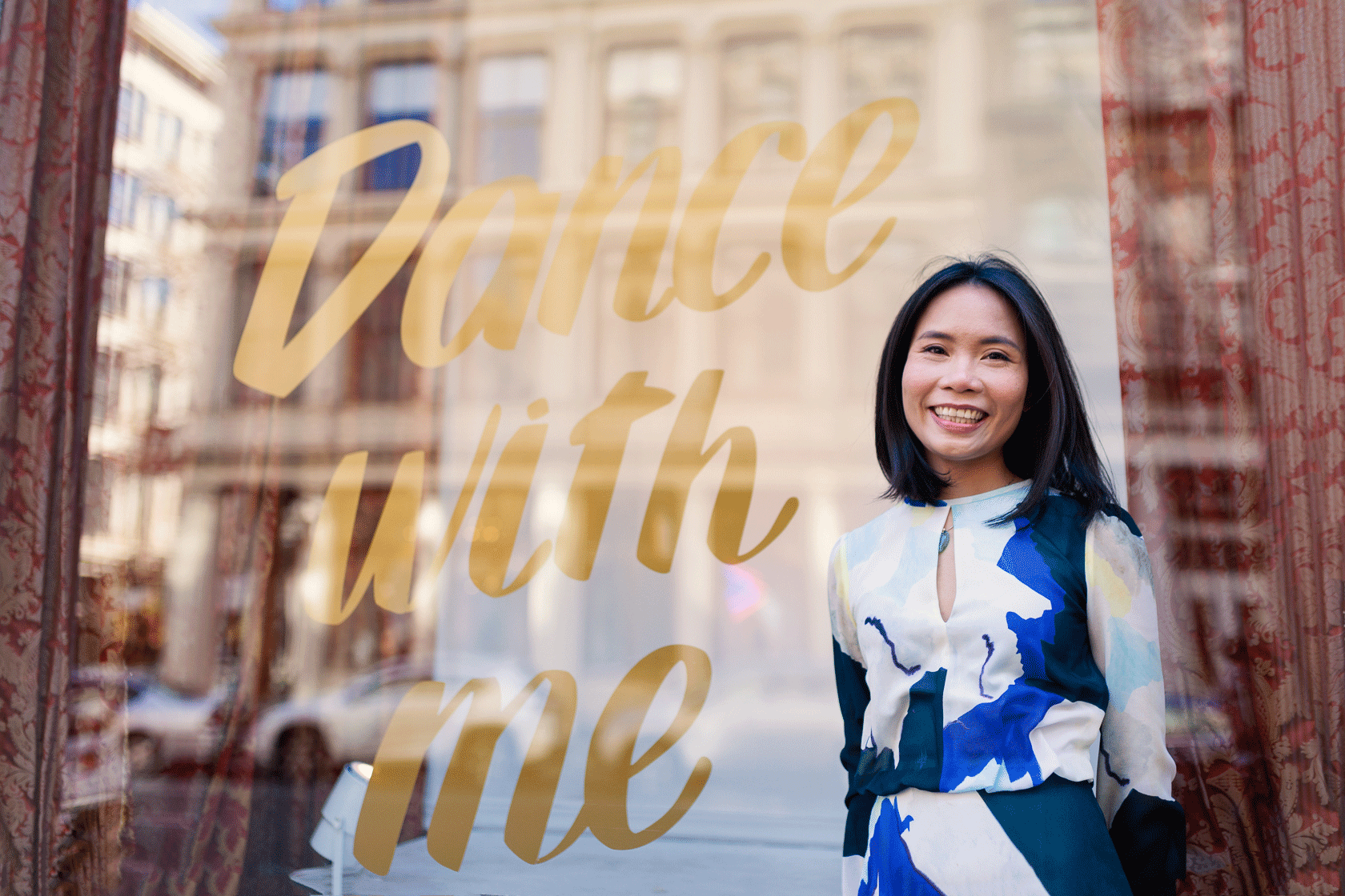
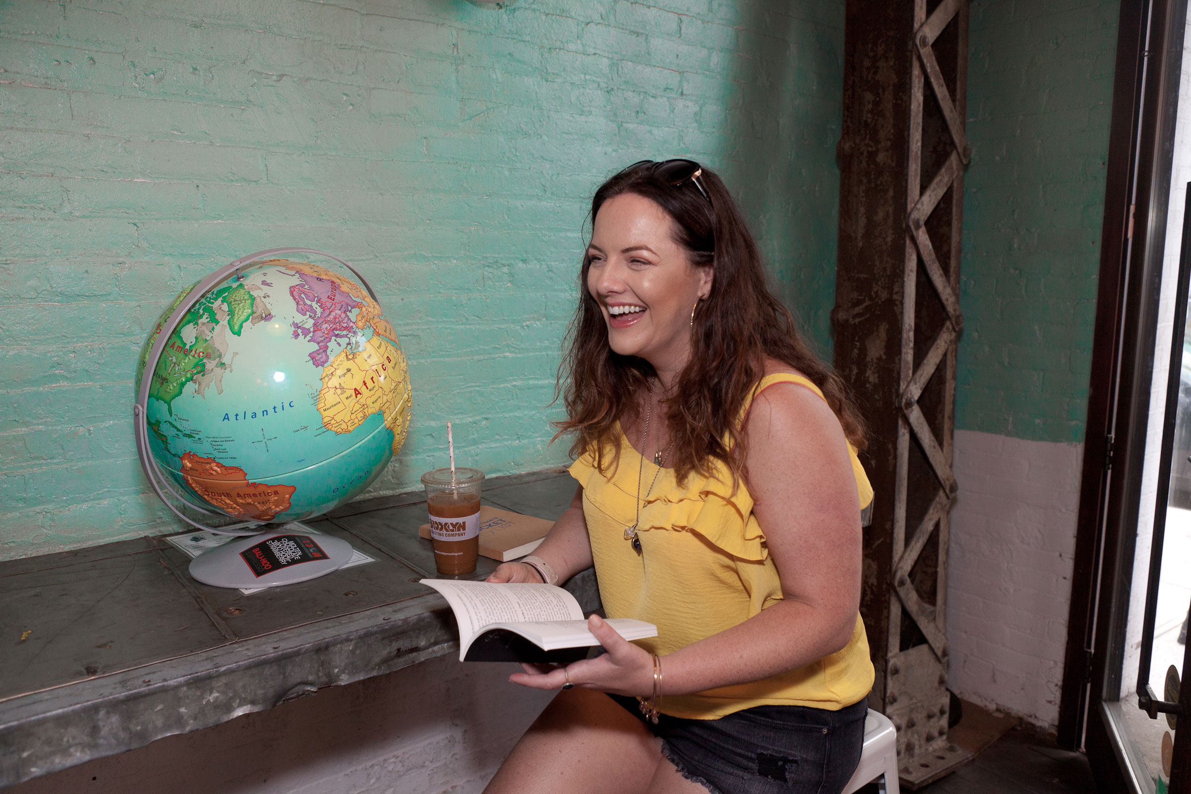
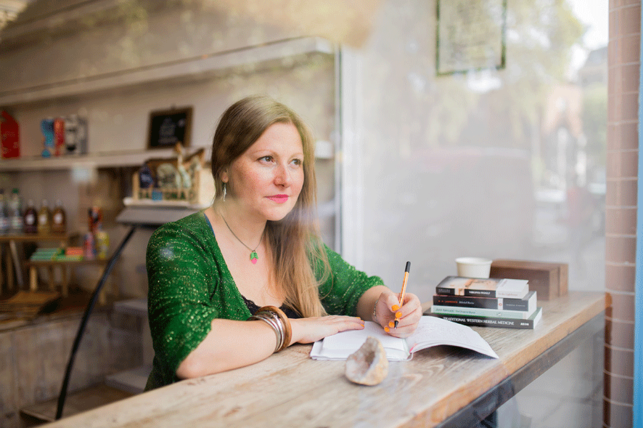
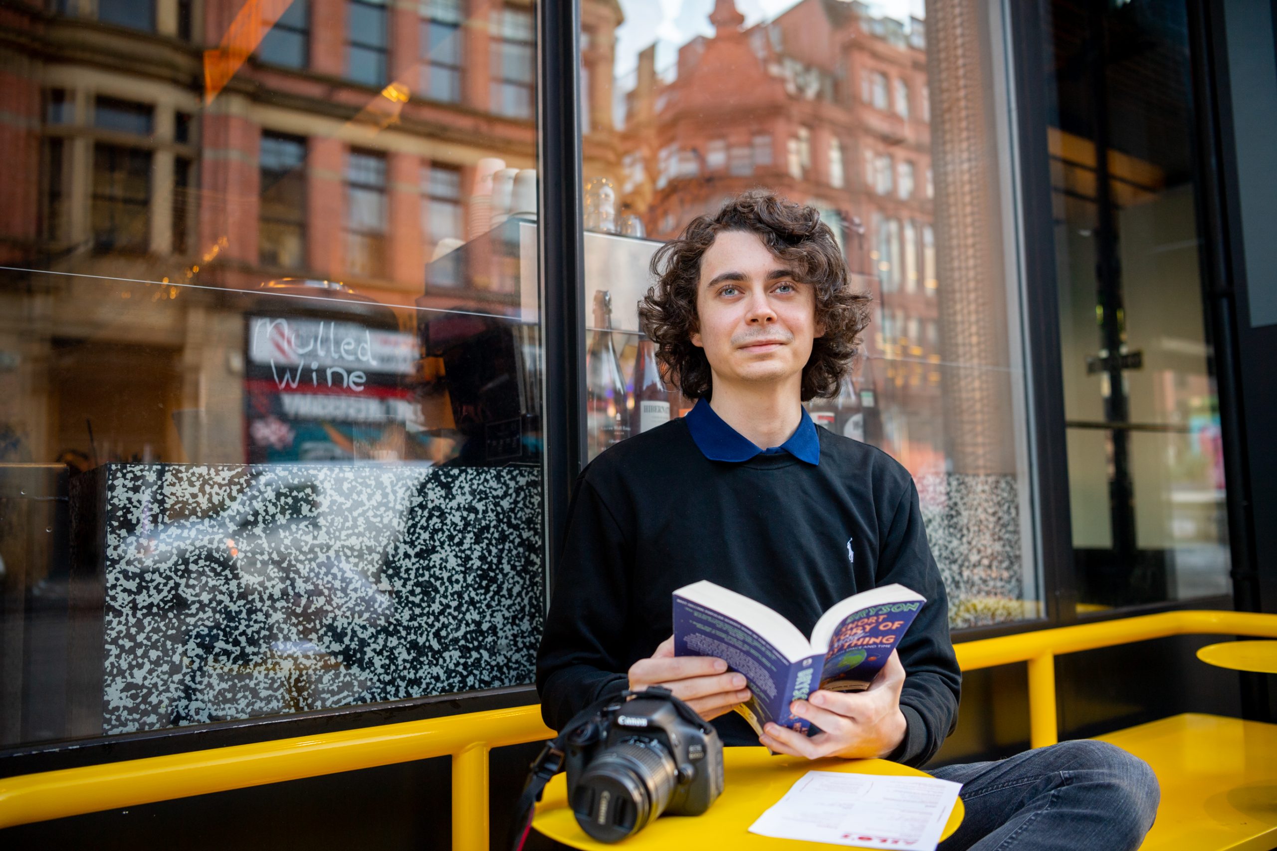
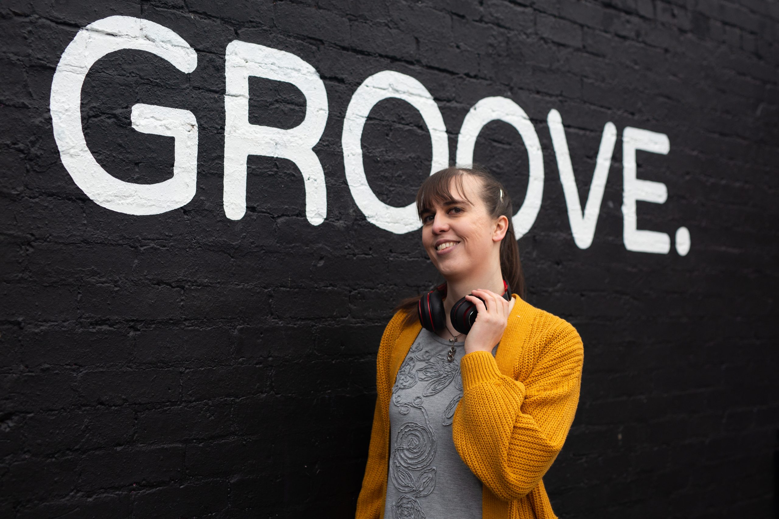
03. Ideally, you also need at least one shot that showcases elements of your personality – whether that’s via your outfit, the backdrop, a prop or whatever (.. but more on that later).
In fact, how many photos should you have on your dating app profile at any one time?
I’d recommend having about 5 or 6 photos on your dating app profile at any one time. Too few and you’ll put people off as they will think you have something to hide. Too many (you know those profiles where people have 10 to 15 photos including one of their favourite plant and another of their cat, Arnie) and you can end up putting people off. You’re providing them with more content for them to find fault with and people do often go into this with a negativity bias, expecting not to be attracted to someone, rather than the other way round sadly.
I’d also recommend mixing things up every 6 weeks or so, especially if you aren’t getting much attention. Every time you refresh your profile photos and your bio, you’ll garner a flurry of attention again.
What are the top two biggest mistakes people make with their dating profile photos?
Oooh, gosh I have so many pet hates, but my top three are…
01 Poor quality shots of course.
I may be a professional photographer but it definitely isn’t just photographers who crave a richer visual experience when doing anything online. If you want to market anything online, from clothes on Bebop to apartments on Airbnb you know instinctively that the people using better quality images are the ones attracting attention and sales online. This desire to review good quality images isn’t just limited to shopping and apartment hunting, it most definitely extends to online dating too. If you’re still using blurry holiday snaps and old selfies, expect to be overlooked time and again.
02. Group shots
Nooooo, why do people still do this in 2019? OK, lets put it like this… you have 5 to 6 photos to really capture someone’s attention and make them want to contact you, not just contact you but make the effort to go out and meet you IRL. There is a LOT of competition out there, as swiping on dating apps is now the norm to finding dates, so your profile photos need to work really hard for you. Now if your profile is full of group shots, you’re losing out big time. Firstly you’re making people work too hard. Who has time to find one amongst five faces in every other photo? Secondly, supposing they don’t like the look of your drunk mates? Thirdly, imagine they do like the look of your mates… in fact one mate in particular, your gorgeous best friend! OK, do you see where I’m going with this? Group shots puts up unnecessary obstacles between you and a hot date. They need to go… 🙂
What are two quick wins everyone can do to upgrade their dating photo game?
01. Fifty shades of red
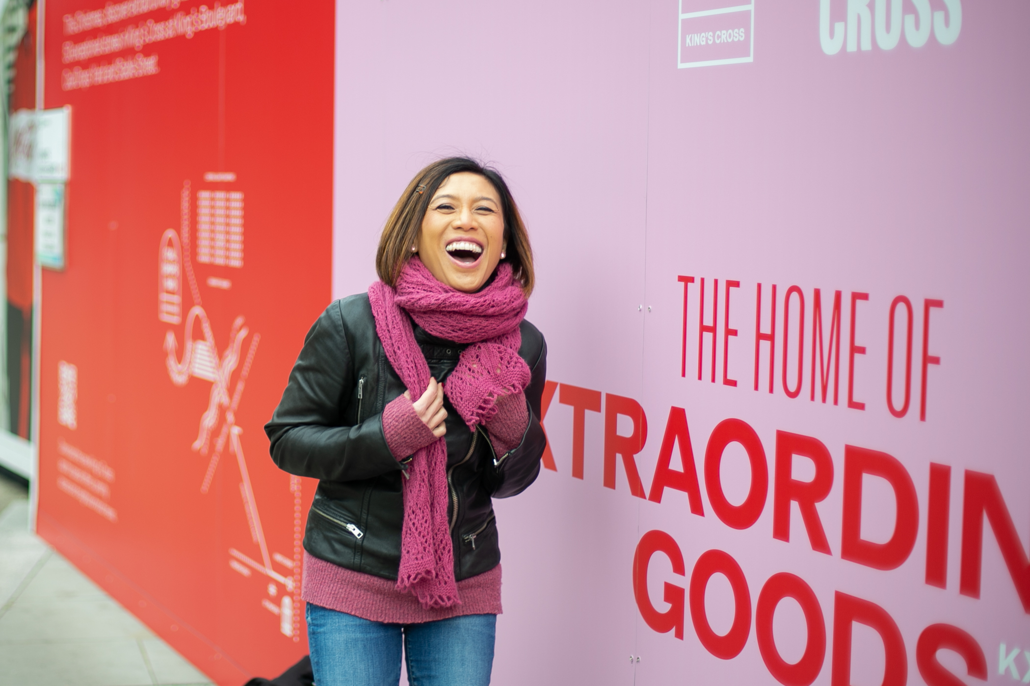
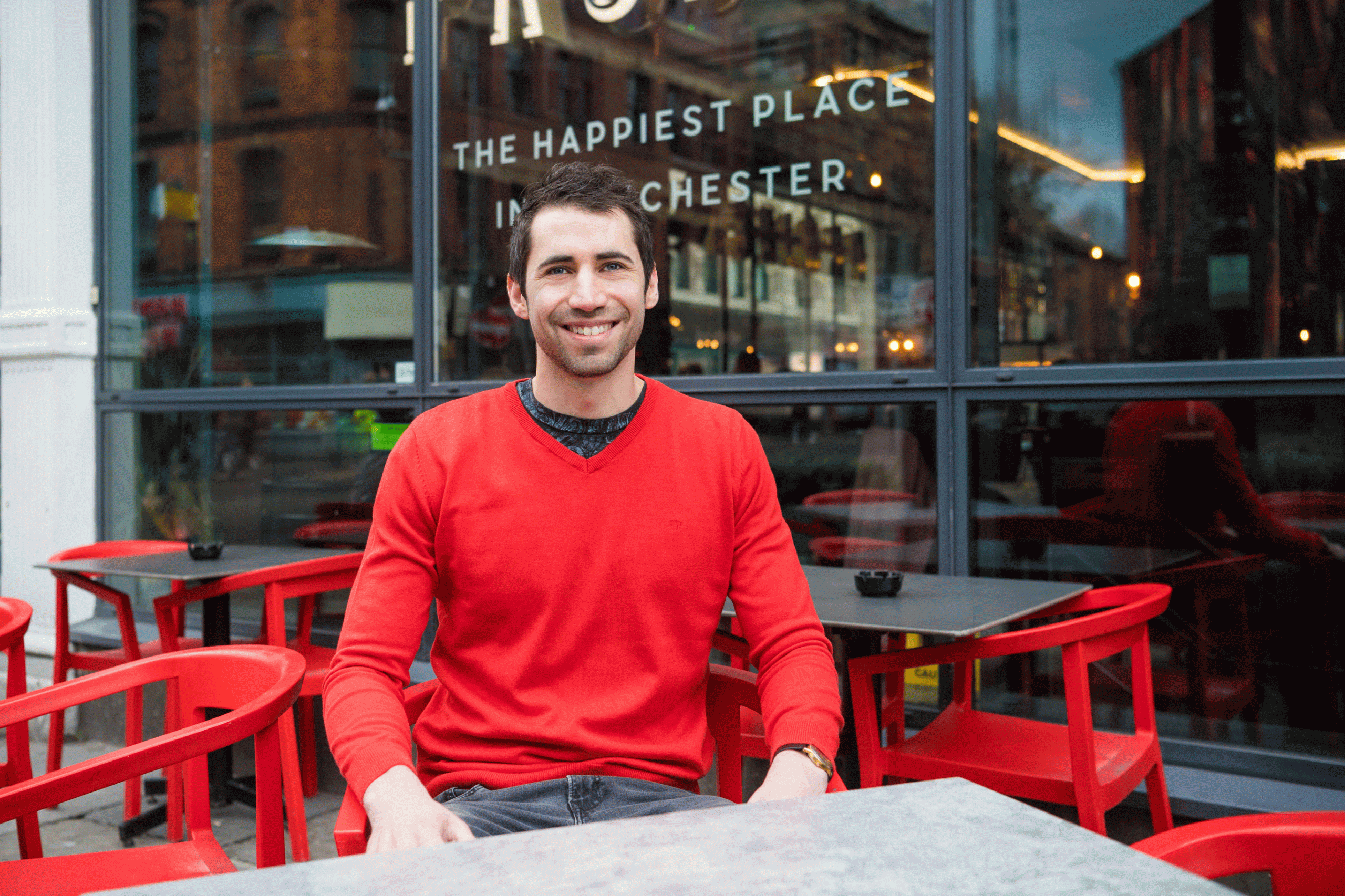
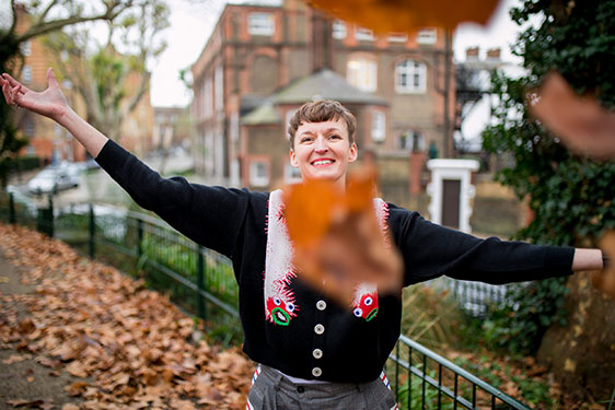
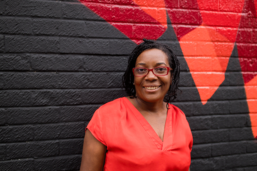
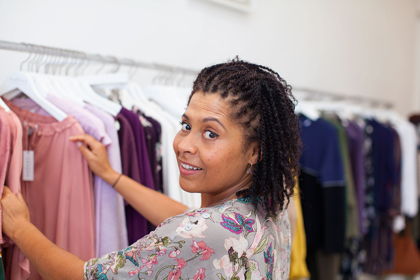
So my favourite easy win, to stand out online, is to add bright colour to your photo. Have you noticed that a lot of dating app photos are in neutral colours e.g. grey, white, browns etc? This makes them very easy to swipe past. Add some bright colour either to the background or your outfit to turn heads and win dates. Red is the colour of love, passion, energy, attraction and also makes people’s hearts literally beat faster, thereby mimicking that ‘falling in love’ feeling you get. I’d definitely aim to include bright red in at least one of your dating app photos!
02. Show them who you are
My second one is to find a way to tell people something meaningful about you in your photos. For example, for my dating app profile, I’d want to include a photo of me with my camera and one of me with my Muay Thai boxing gloves, perhaps in the process of wrapping my hands. I also love vintage adidas so I’d aim to wear adidas in one of them. This is where you’ll need to spend a bit of time just figuring out what face you want to put forward in your profile. Make sure you keep it real though… don’t forget..
Great photos attract attention. Authentic ones keep it.”
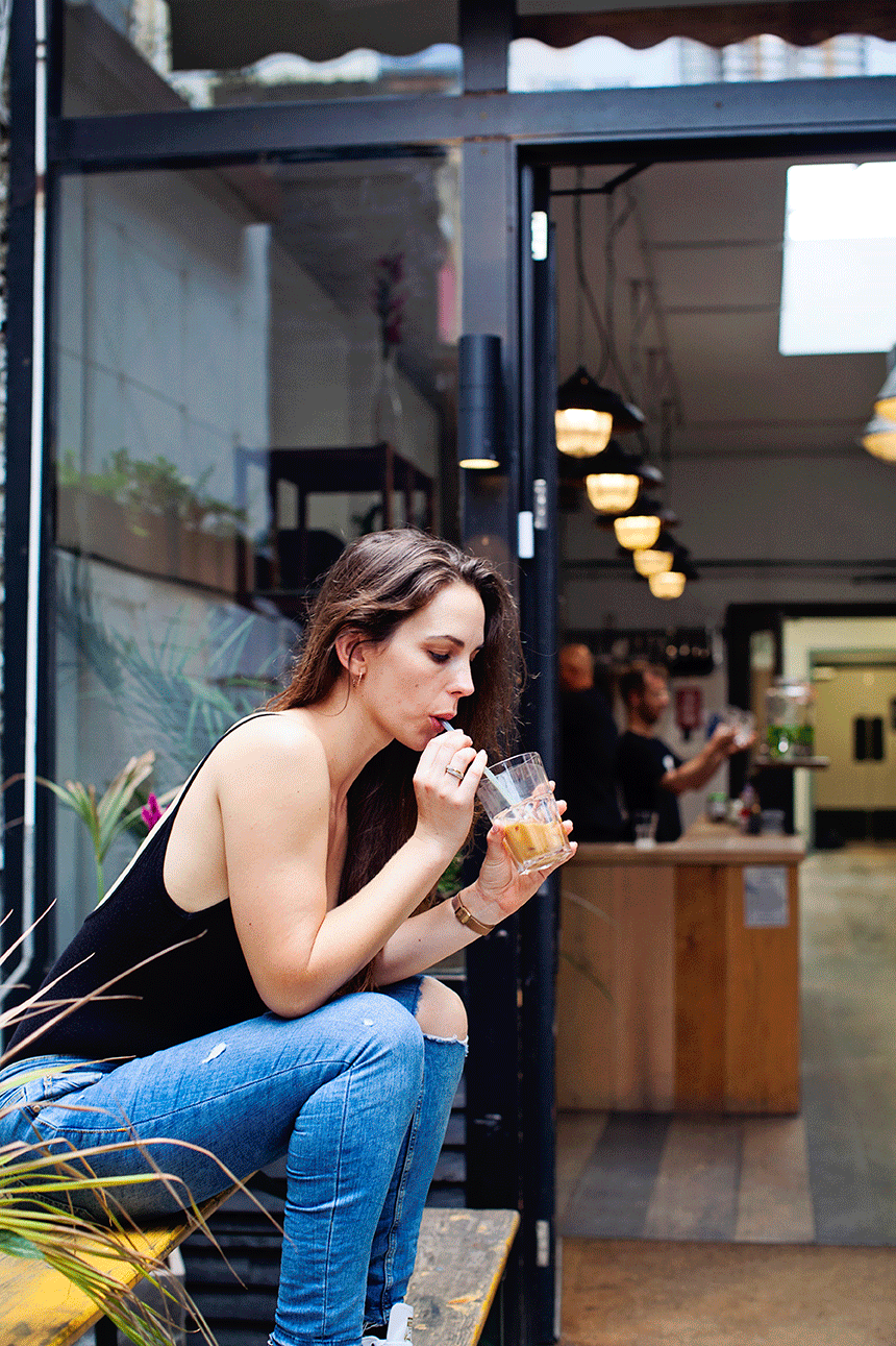
And finally, where do you stand on selfies – yes or no?
OK, so I don’t want to come across as sexist, ageist or anything like that (I don’t make the rules here, dudes, I’m just reporting back from data), but apparently women in their twenties (and teens) are the only people who can ‘get away with’ using a selfie on their dating profile. It’s seen as cute, flirty and intimate when they do it. For everyone else, it’s a big no-no. It comes across as unattractive. (Ouch! Well OK then, but that’s not going to stop me using them on my Instagram feed though lol).
Interview by Amber & Saskia, photos by Saskia


