Which Photos Make The Best Dating Profile Pictures Ever
The best dating profile pictures ever
Here at Hey Saturday, the original home of dating profile photography, our whole focus is on helping people create the best dating profile pictures they can, to attract more and better quality matches on dating apps. Most of our clients use dating apps like the ubiquitous Tinder, Hinge, Her, Bumble, Grindr, Match, Plenty of Fish (in the US), eHarmony etc. We’ve been serving awesome dating profile pictures since 2013, so have a lot to say and share on which photos make the best ones.
The most important thing to realise is that every photo you share in your set needs to be working hard for you. Your dating app profile pictures are like your premium advertising space – and you can’t afford to waste it. Each photo has a role to play. It might be showcasing you at your best, telling people something intriguing about you, or attracting attention because it includes bold colours and an eye-catching background or outfit etc.
Now, if you prefer to listen to your advice & tips rather than read it, you can check out my dating photo podcast, Shoot Your Shot: The Art of Dating Profile Pictures. Check out this show for my jam-packed mini episodes that will inspire you to experiment, have fun and aim higher when creating your profile pictures for online dating apps.
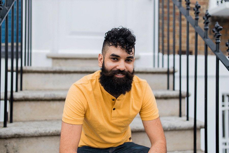
Dating profile pictures reimagined for the Social Media Age.
- Think of your dating profile pictures as a set rather than a grouping of random pictures. Together they need to paint a story. The story of what it would be like to date you.
- Ideally you should use 5/6 photos on your profile at any one time. Any fewer than that and people get a bit suspicious, like they think you might be hiding something. More than that and you’re giving them more content to find fault with.
- Update your dating profile pictures at least once every couple of months to freshen up your profile. Swap in 2-4 new ones to make it look new and fresh and beat the algorithms. You can mix and match Hey Saturday photos with one or two of your own photos.
Top dating profile picture do’s.
- Use good quality photos only. Always. There is no room in this Instagram age to still be using blurry, poor quality photos if we want to make a great impact online. Not convinced and secretly thinking, ‘yeah, yeah, I’ll be fine’? Maybe ponder this – good quality profile pictures attract good quality dates, while poor quality pictures attract poor quality dates. People with high self-esteem are unlikely to value poor quality profile pictures. This is because they believe that people who are willing to use poor quality images are probably willing to settle for other things that aren’t great either.
- Good quality visuals drive up engagement with your dating profile, which is one of your primary goals when it comes to online dating. People will spend a fraction of a second swiping through dating photos and will always prefer to view good quality (think well-lit, bright, in focus) images over poor quality (blurry, low-light, red-eye, pixelated).
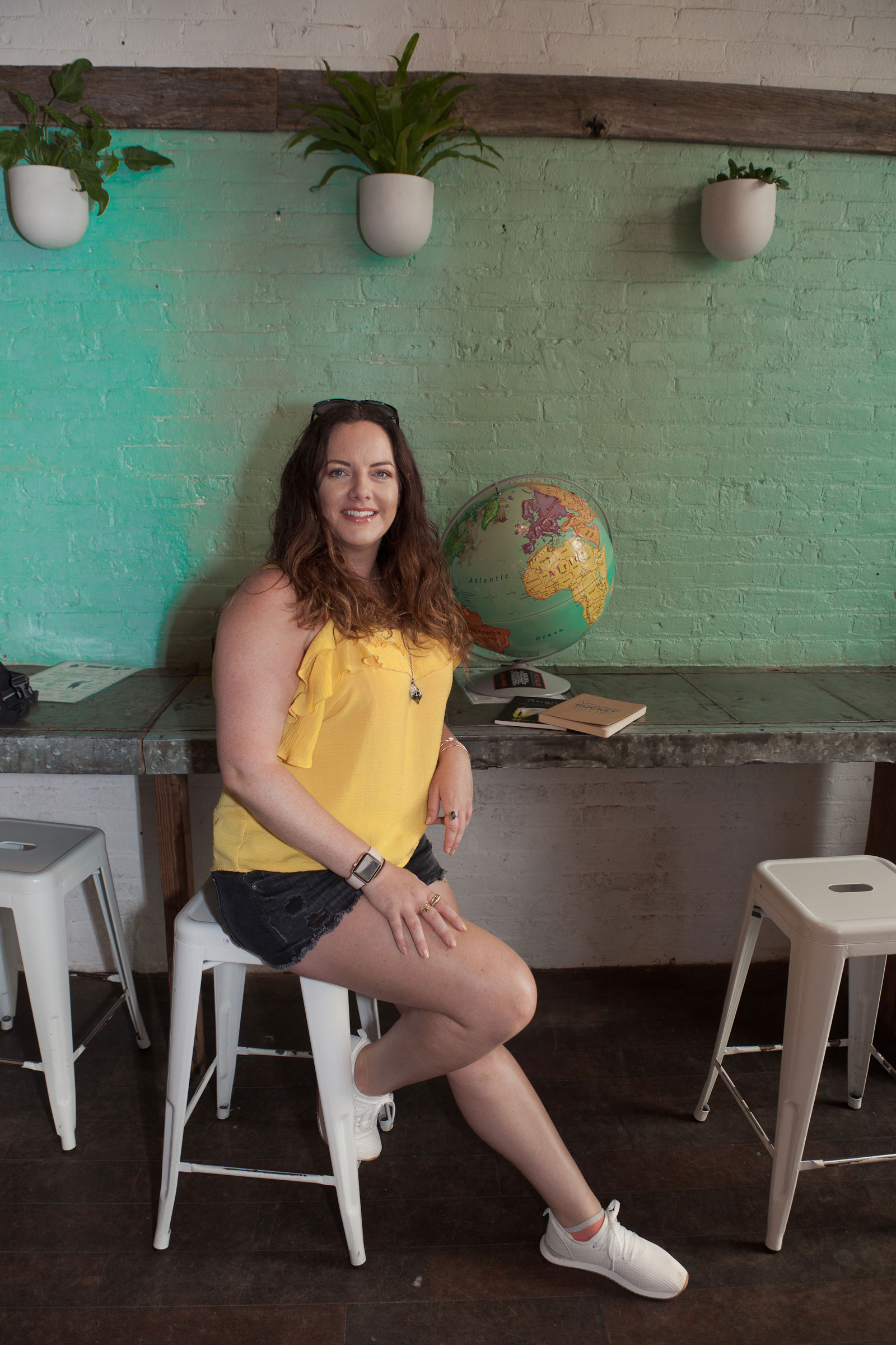
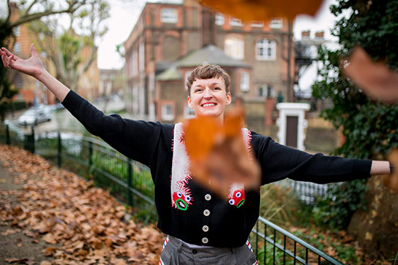
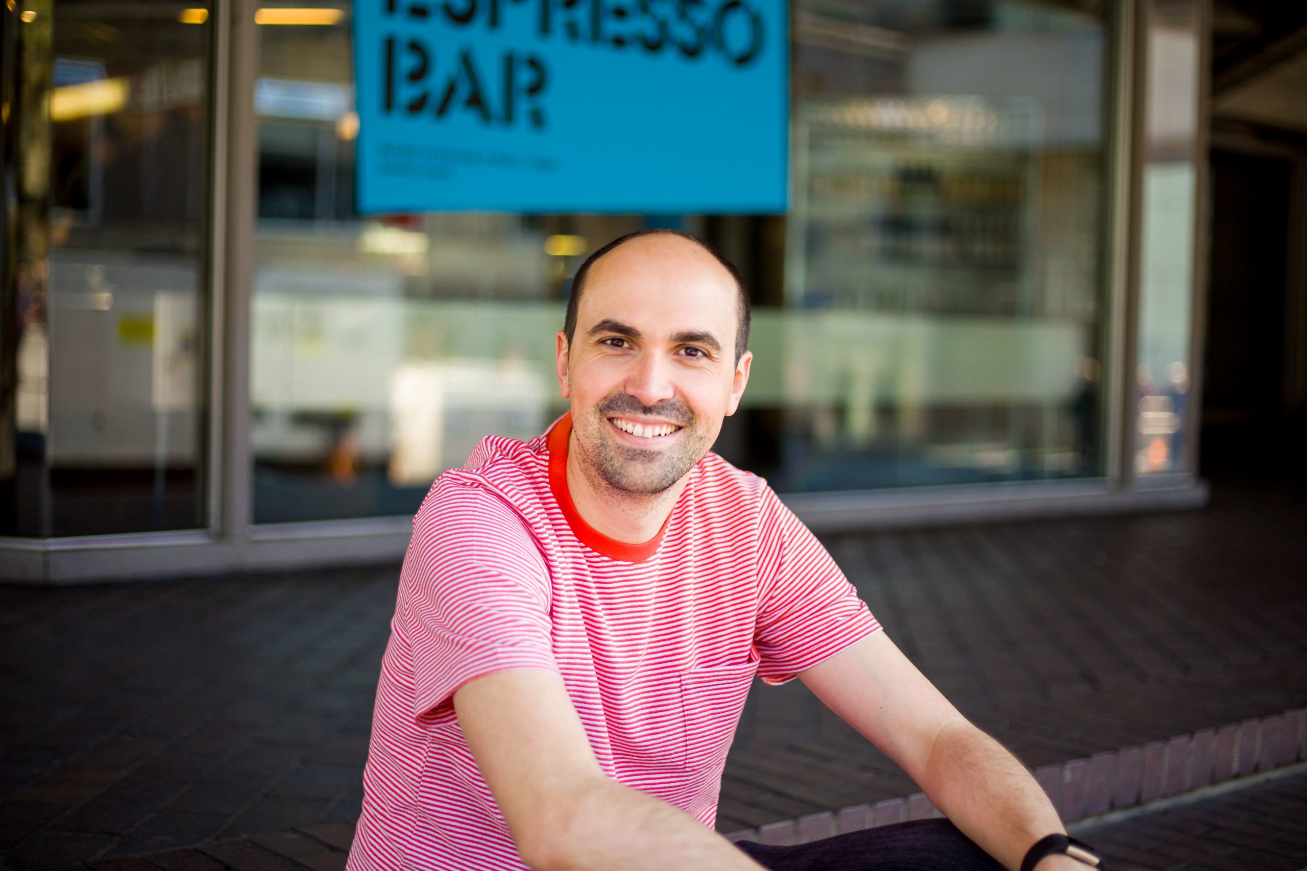
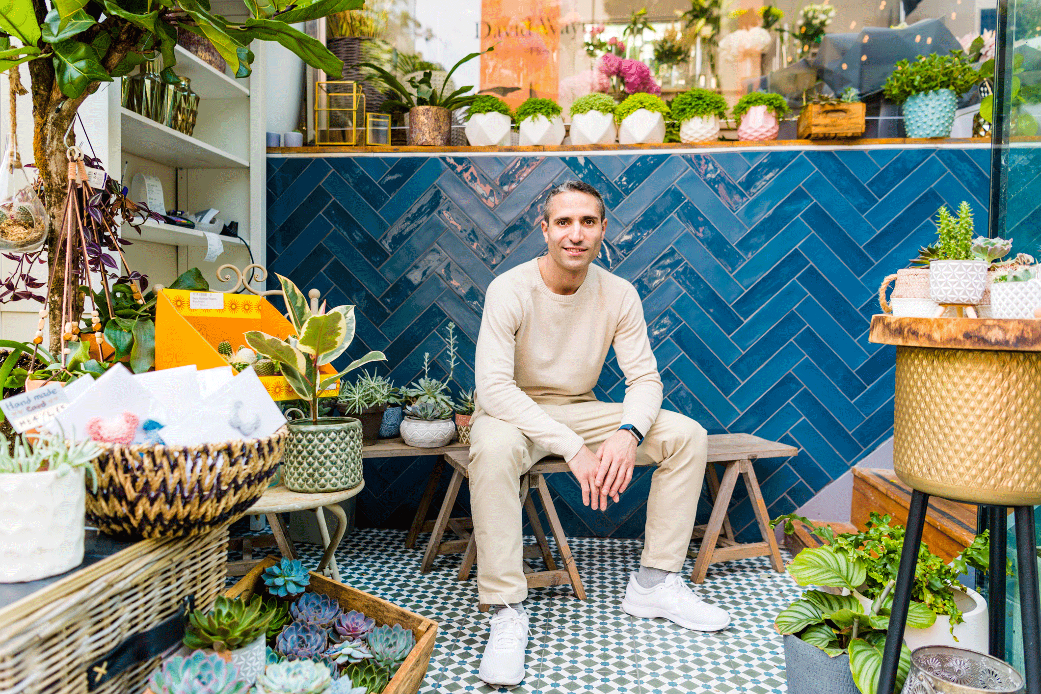
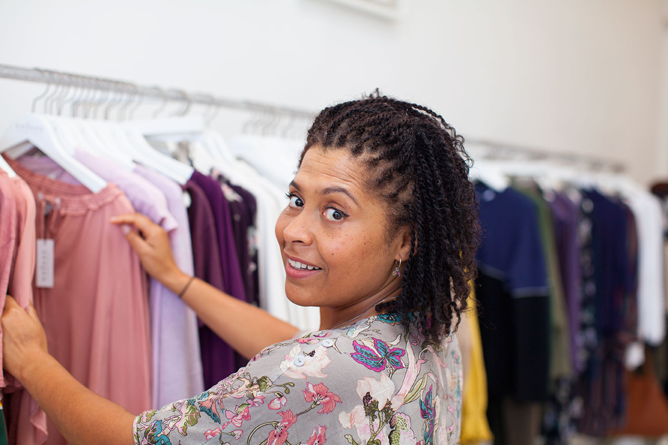
- Create visually interesting, storytelling profile photos. You want them to offer information about you, your lifestyle and your vibe. That way, when people are swiping quickly, they’ll still have a chance to find out quite a lot about you, just at a glance. Include photos that show people what you love doing, where you love hanging out, what your passions are and what’s important to you in life. Hopefully there will be something there that will make them pause, do a double take, check out your bio and then reach out and connect.
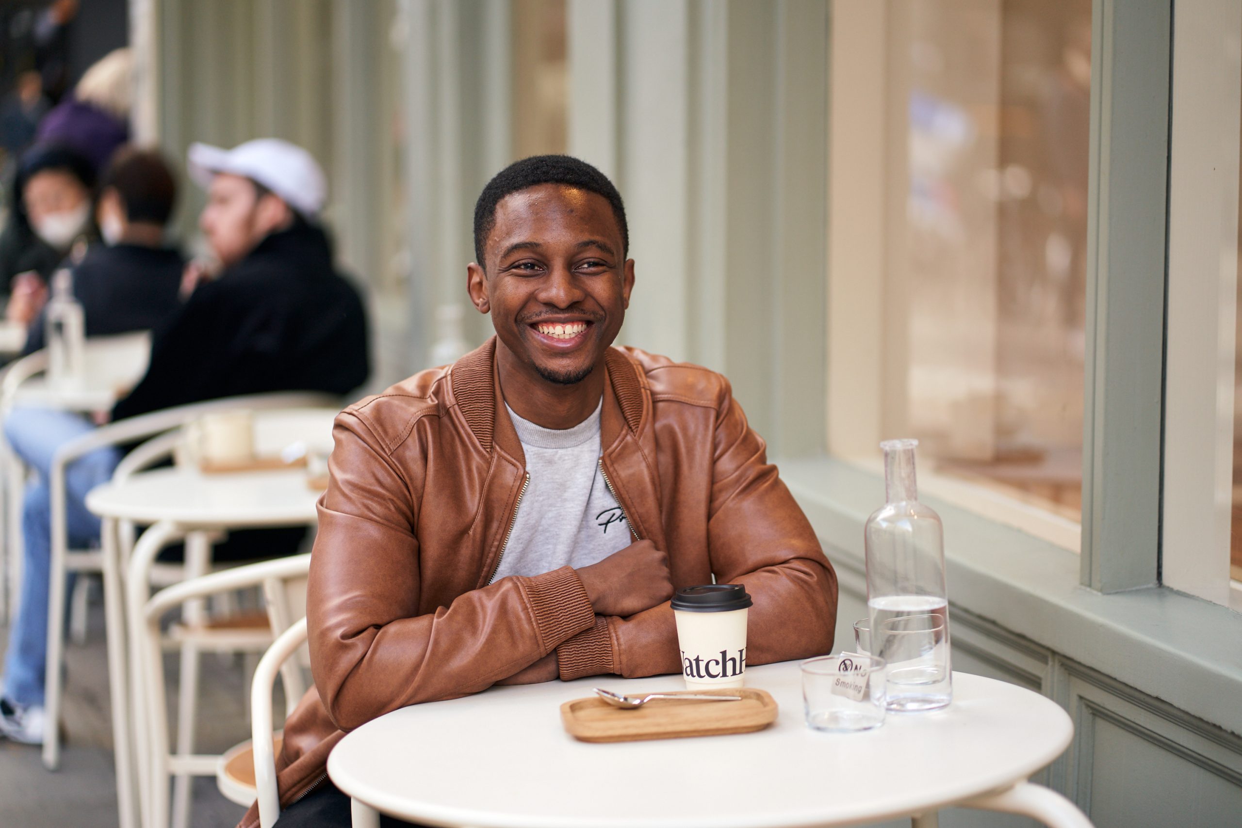
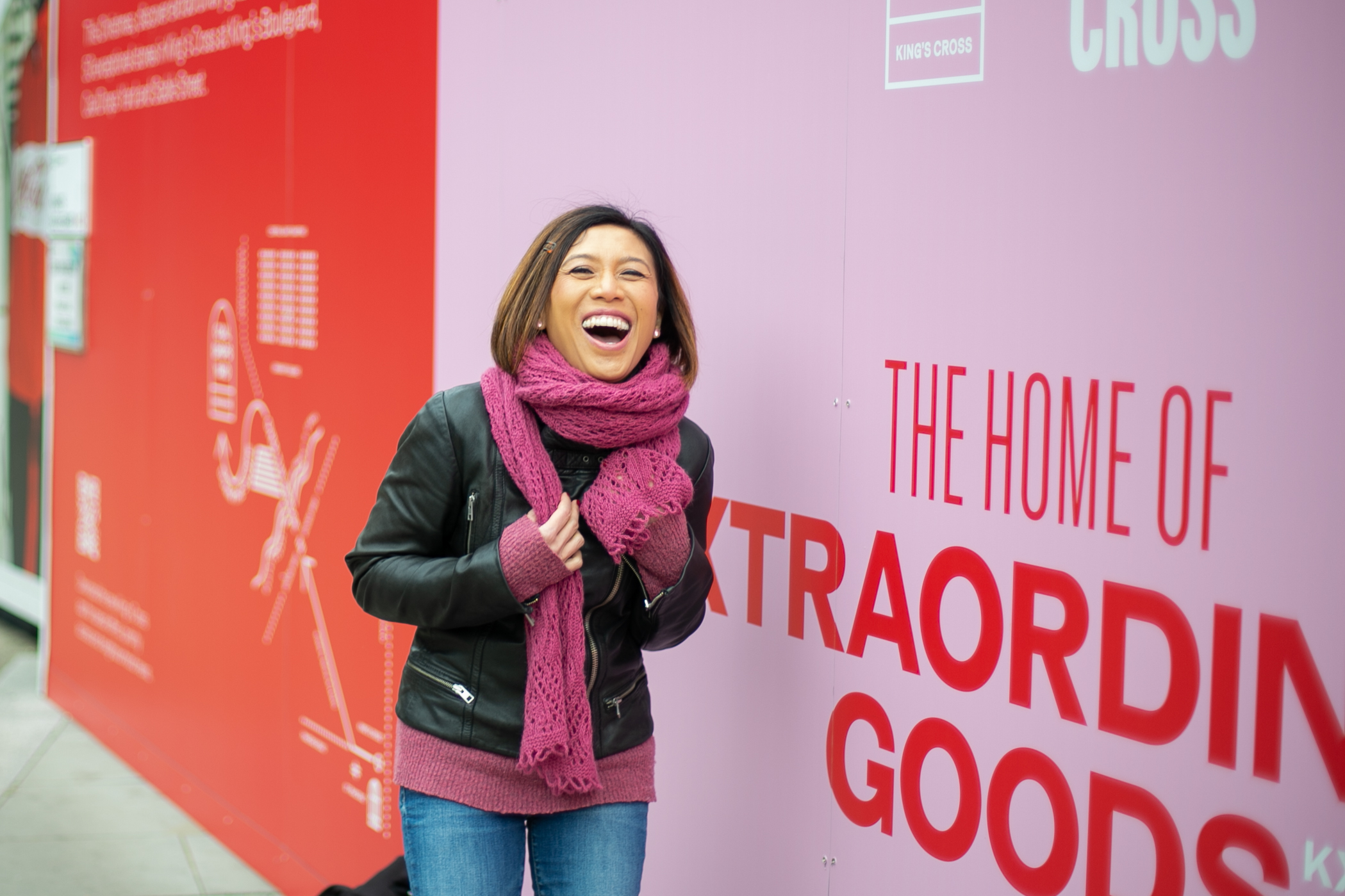
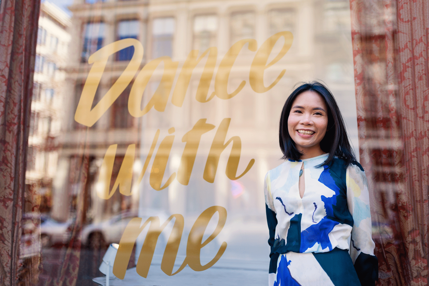
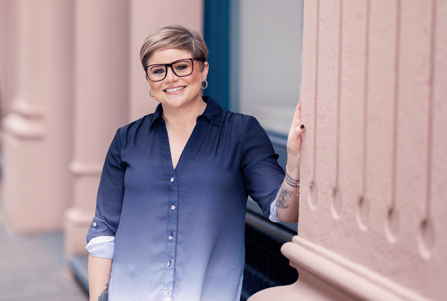
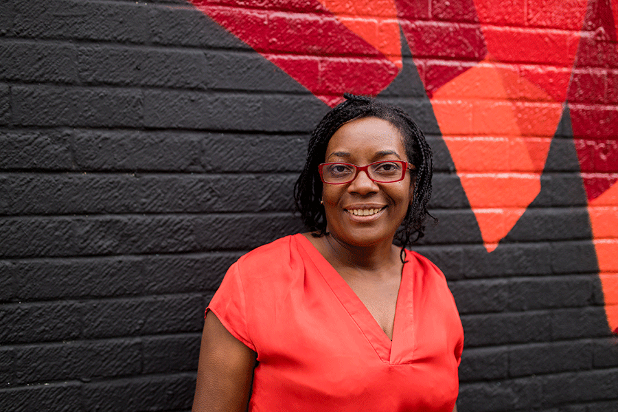
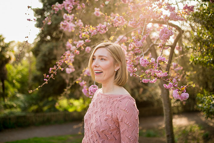
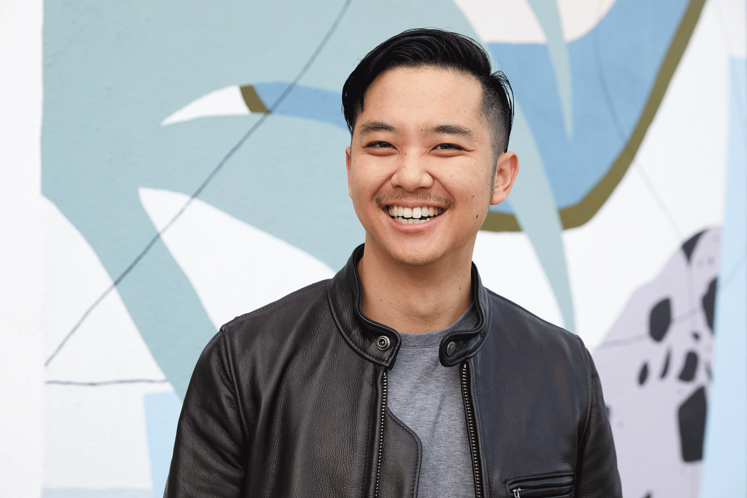
- Select a gorgeous primary headshot. Now this photo has a lot of work to do. It’s the first photo people see and will be the one that either encourages people to take a closer look at your profile or swiftly move on. You need to be looking as hot as you can, confident, happy and relaxed. It needs to be great quality, have a simple background that doesn’t detract from you and, in an ideal world, includes some eye-catching colour or other detail (e.g. bold statement jewellery or outfit).
- Include one full body shot. Every dating profile needs to include one full body photo. People will want to see all of you before deciding whether to reach out. Given how easy it is to deceive someone using cropped images, people are very keen to see the whole package. Don’t skimp on this step or you may find your profile gets repeatedly overlooked.
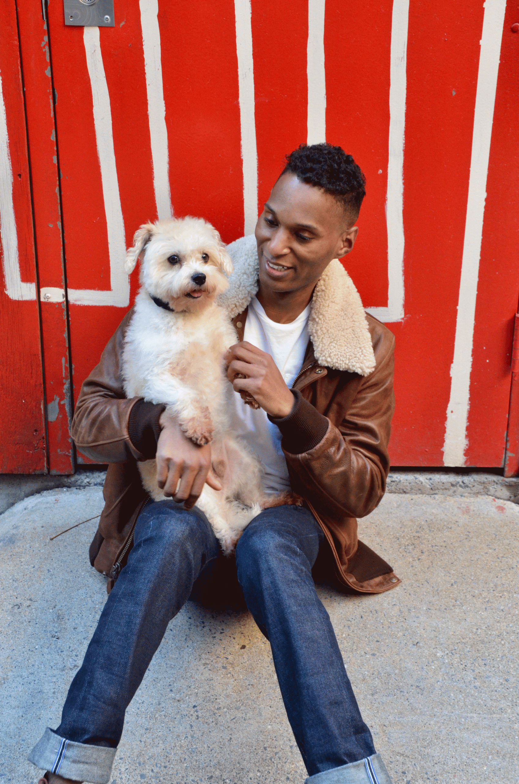
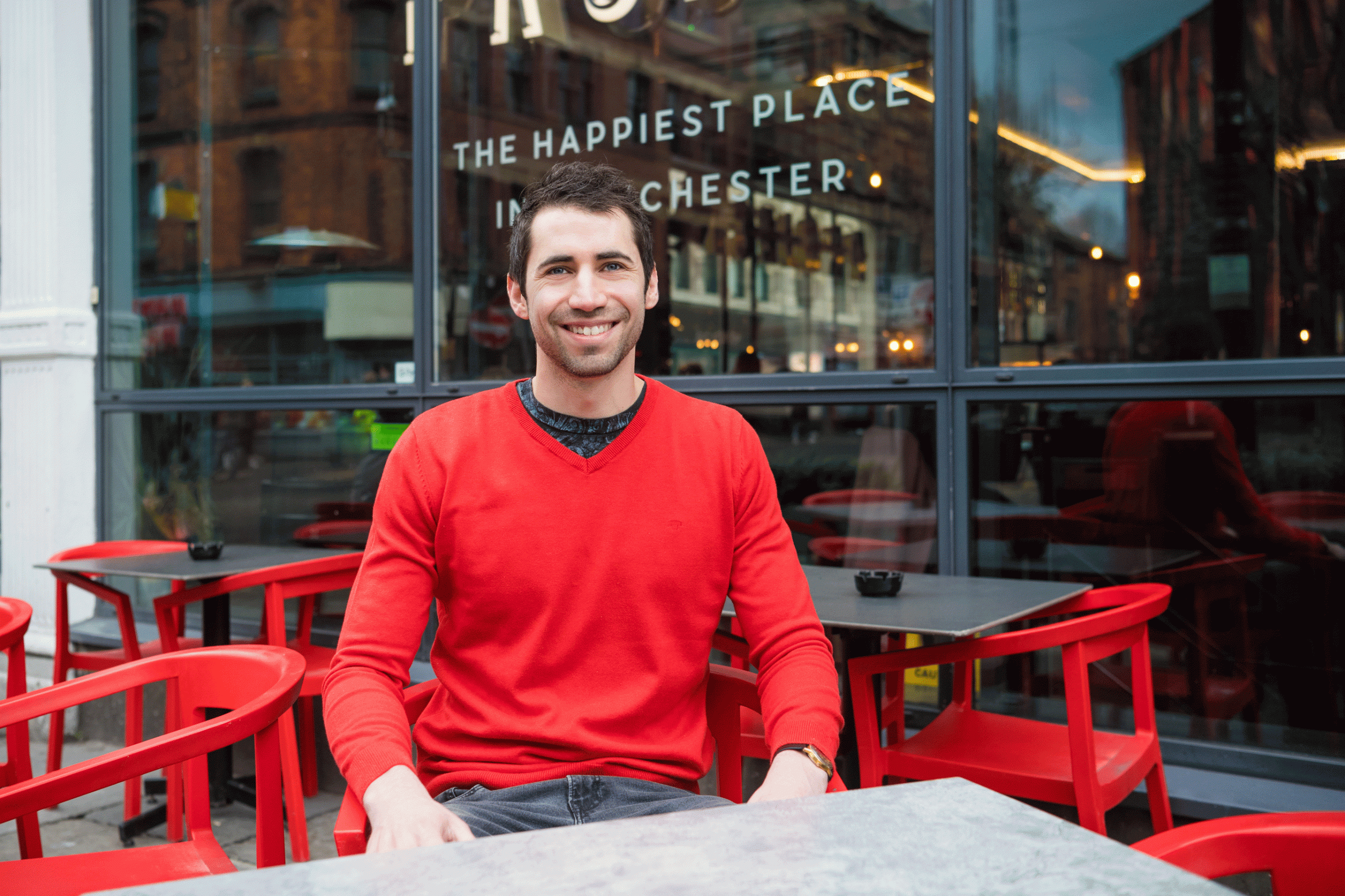
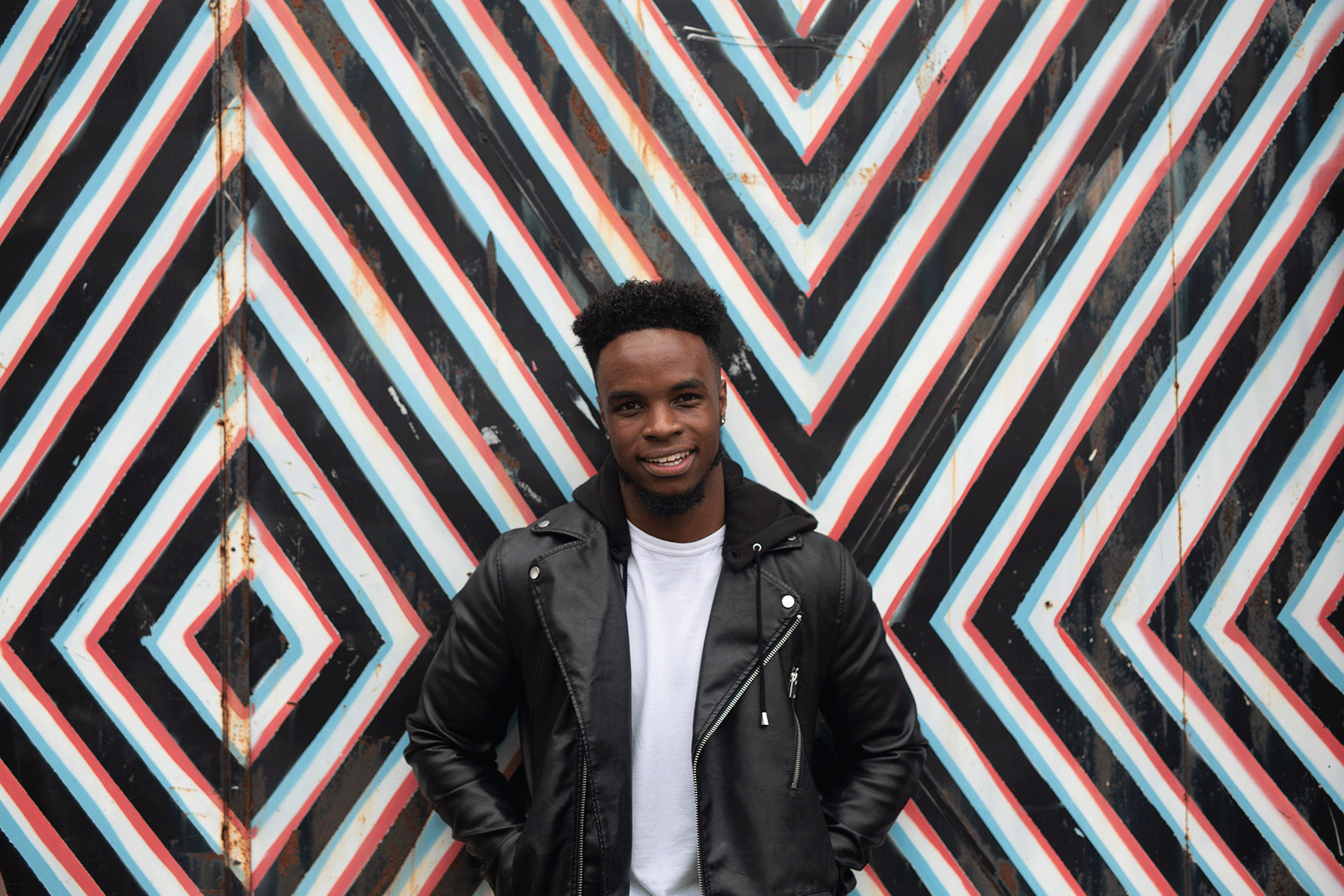
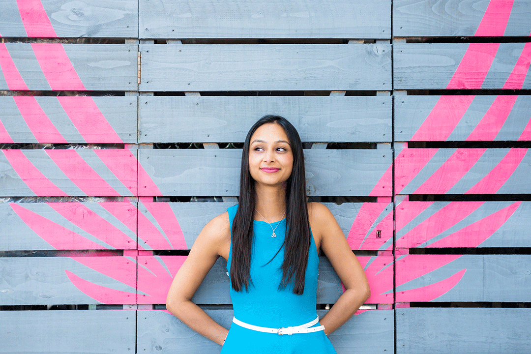
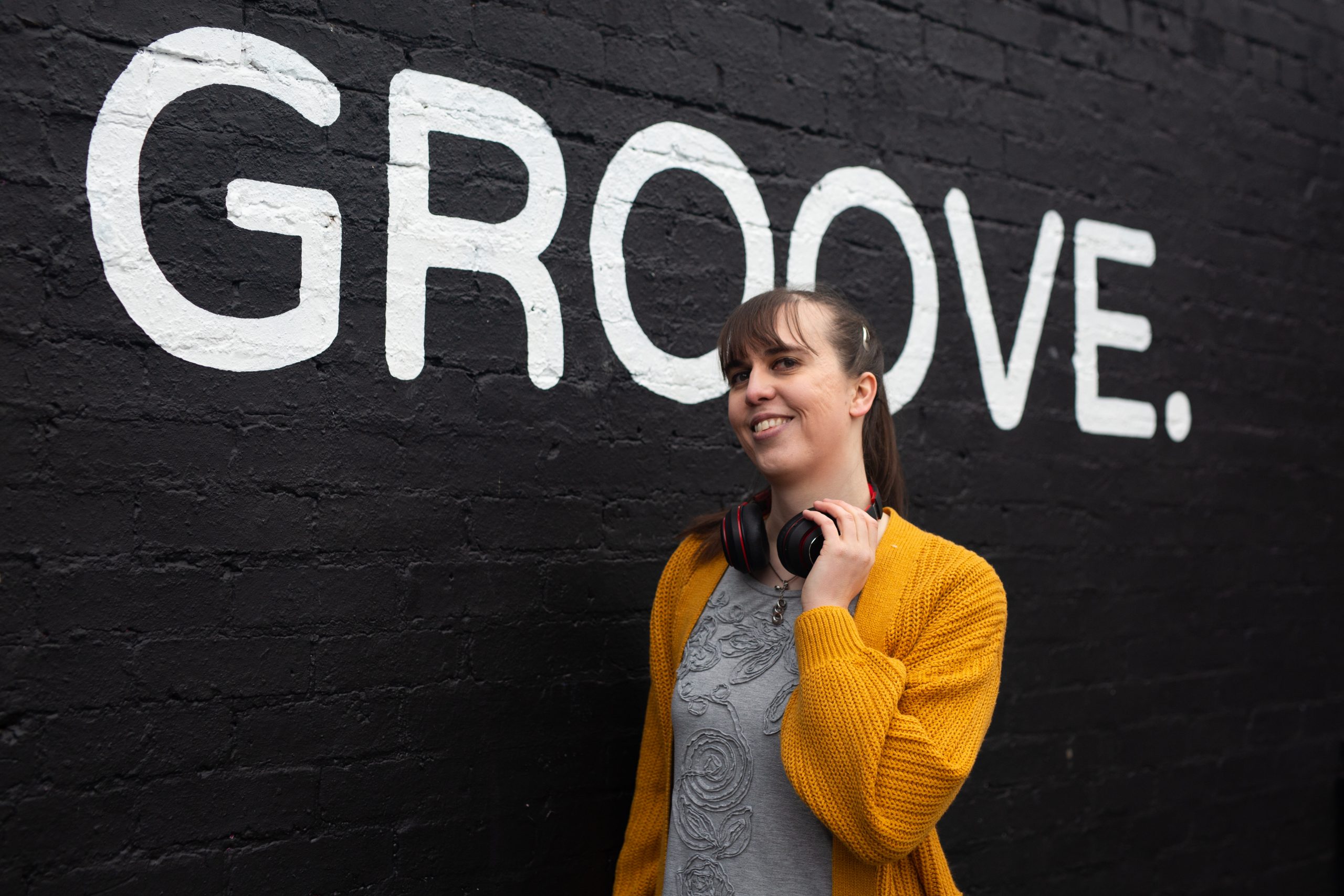
- Embrace bold colour. Here at Hey Saturday, we’re obsessed with bold, colourful dating profile pictures. In fact we were obsessed with it long before the founder of Tinder’s old CEO, Sean Rad, announced that the use of colour attracted radically more attention online.
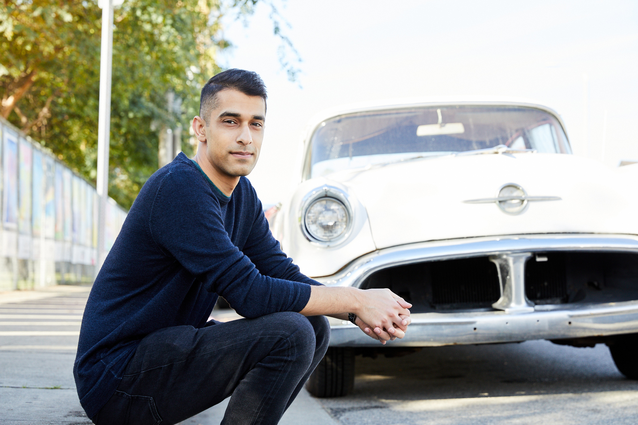
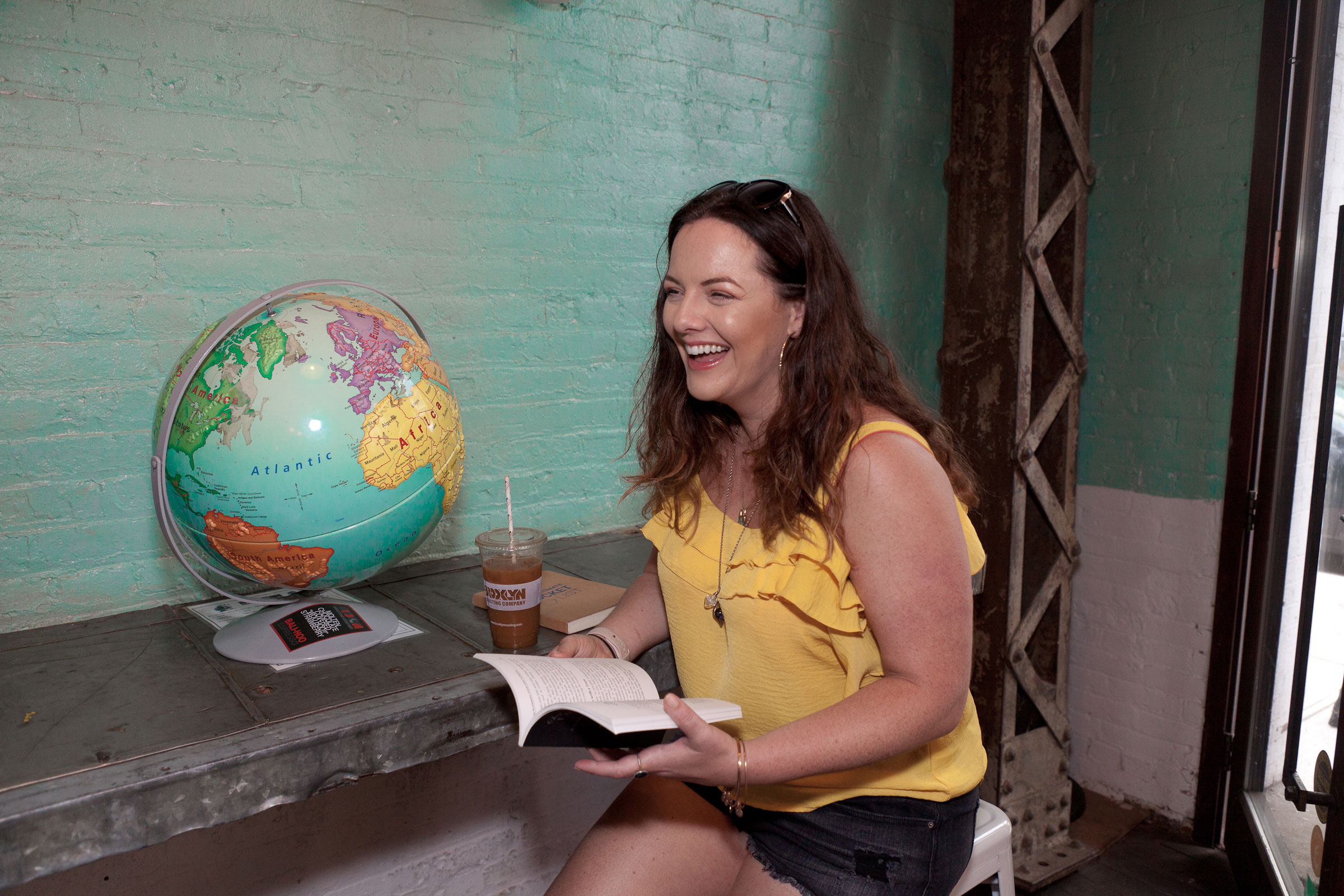
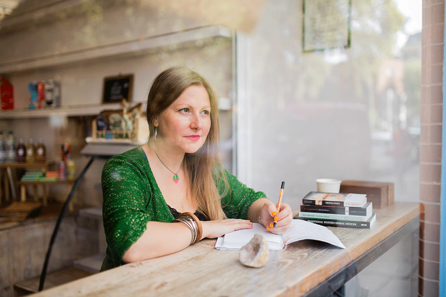
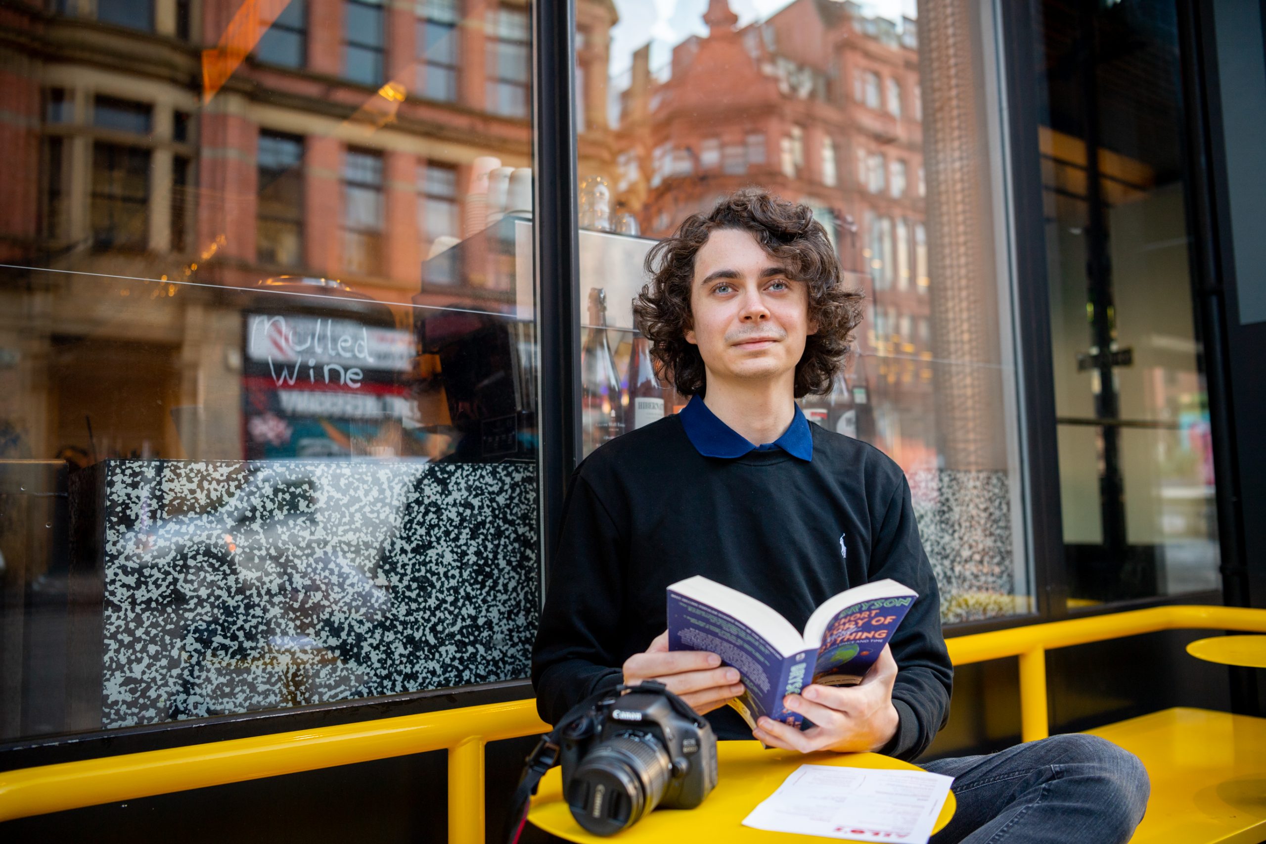
- Include a talking point photo. This is such a powerful tip and one that is often overlooked. Give it a go and see what I mean. Something in your photo needs to interesting or intriguing. This will then give people an easy opening to slide into your messages and ask you about it. Bearing in mind, most people don’t know what to say in messages beyond ‘Heyyyyy’, this is actually a pretty badass hack. OK, so you’re wondering what kind of thing might do this? It doesn’t have to be complicated, it could be a copy of your favourite book. Maybe they LOVE that book. It could be you enjoying a delicious but ridiculously large ice cream. Or maybe you’re hanging out with your dog. Maybe you play the banjo or practice a martial art. Anything that emphasises the unique you, include that.
Top profile picture don’ts
- Lose any photo you’re not 100% sure about. If there’s a photo in your set of dating photos that you’re not 100% sure about but you’re thinking you might as well as include it – well yeah, don’t do that. People scan quickly through your photos looking for your best dating profile picture, swiftly followed by your worst. (I don’t think people even realise they’re doing it, so you may not be aware, but you probably do this yourself). They tend to make that all important decision, whether to connect with you or not, based on that worst photo! Eek. Don’t risk it.
- Lose any misleading photos you might have. You know, deep down, it makes sense. Ultimately, people are looking for trustworthy people online with whom they can build a meaningful relationship. If they arrive on a first date to find out you don’t look the same as you do in your profile pictures – it doesn’t matter how charming you might be on the date, you’ve lost them. They will feel deceived and how you make people feel is everything. Remember, great photos attract attention. Authentic ones keep it.
- Avoid group shots like the plague! And here’s why. They’re super boring. Everyone has them and they don’t add anything meaningful to your story other than the fact you have friends. Most people have friends so this isn’t really news! Plus you’re giving people an opportunity to find fault with you (e.g. they don’t like the look of your friends, or perhaps worse, they fancy your mate more). What a waste of an opportunity. Don’t forget this is your premium advertising space, be the star of your own profile pictures!
- Avoid closed body language in your photos. Don’t underestimate the power of open body language. Open body language is when the chest is up and back, the head is high, the arms and hands are open and uncrossed. Imagine you have crossed arms in your profile picture. At best you appear defensive. And at worst, aggressive. Neither of these options create a good vibe for your profile pictures.
Words by Saskia Nelson. Photos by Nicole (Hey Saturday London), Alison (Hey Saturday New York City) & Carla (Hey Saturday, New York City).

